01
Where the idea came from
Personal motivation, then a broader product question
The idea began partly through conversations with a friend who works at FIRS. Those conversations made me think more seriously about how difficult it can be for business owners to keep track of financial records and stay prepared for compliance obligations.
Because I was already interested in FinTech, I started exploring whether the deeper problem was bigger than tax itself. If a business owner does not have a clear view of sales, expenses, unpaid customers, stock, and records, compliance readiness is only one symptom. The broader opportunity was to help business owners understand what is happening inside the business day to day.
02
Reframing the problem
From compliance concern to business visibility
As I explored the problem, it became clear that a tax app would address only one part of it. The broader issue was visibility: records are often scattered across cash, transfers, PoS, WhatsApp chats, notebooks, screenshots, receipts, and memory.
When records are scattered, business owners can struggle to answer practical questions: What came in today? What went out? Which customer still owes? Which stock items are running low? Are the records complete enough for tax, loan discussions, rent renewal, or business planning?
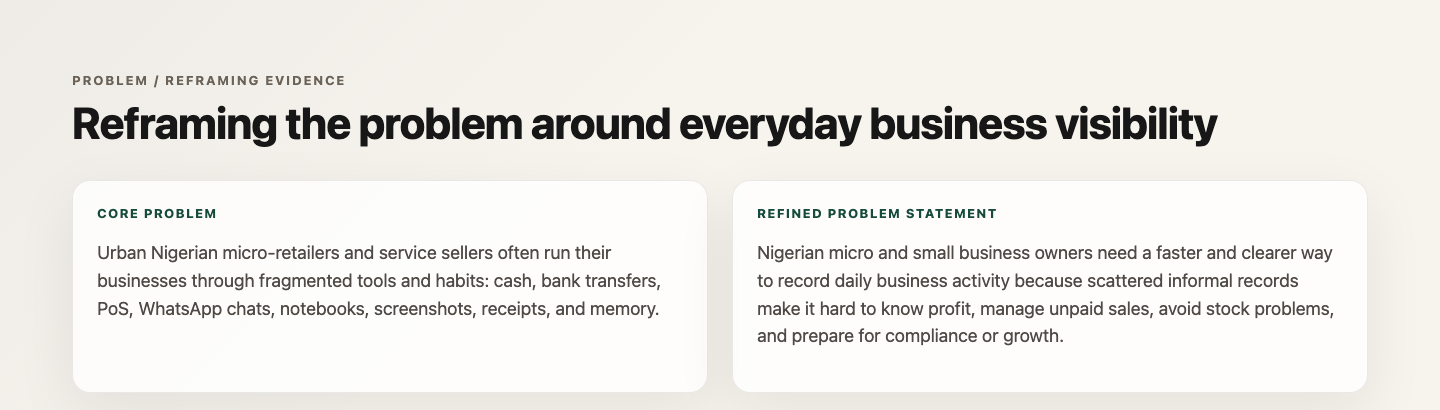
The documented problem framing that moved the product toward everyday business visibility.
I moved away from a compliance-heavy mental model and designed around everyday business visibility. Tax and compliance readiness stayed in the product, but as supporting context around better records, not as the entire product promise.
03
Defining the product
A useful boundary is part of the product
BizPilot needed to be useful without pretending to be accounting software, a bank, a loan product, or a tax authority. That boundary was important because the product sits close to sensitive financial and compliance decisions.
The MVP focused on a practical loop:
- record sales and expenses quickly;
- separate payment method from payment status;
- make unpaid and part-paid balances visible;
- show a plain-language dashboard;
- keep inventory lightweight;
- support reports and records readiness;
- give people visible data controls.
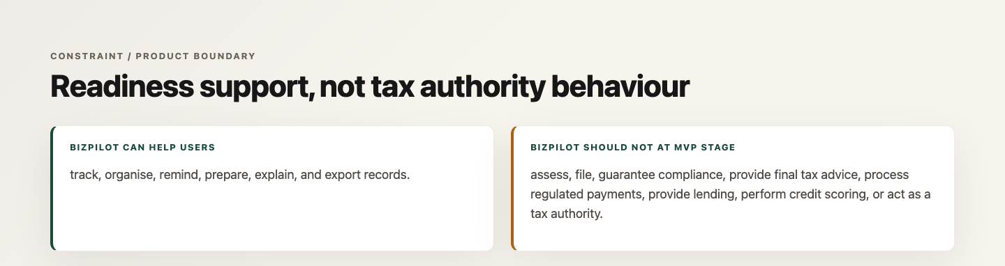
The MVP boundary keeps BizPilot focused on tracking, organising, reminders, readiness, and record visibility.
The legal and regulatory research annex helped define the product boundary. It clarified what BizPilot could safely support at MVP stage: tracking, organising, reminding, preparing, explaining, and exporting records. It also clarified what the product should not do: assess tax, file returns, guarantee compliance, process regulated payments, provide lending, perform credit scoring, or act as a tax authority.
04
Structuring the experience
Daily actions first
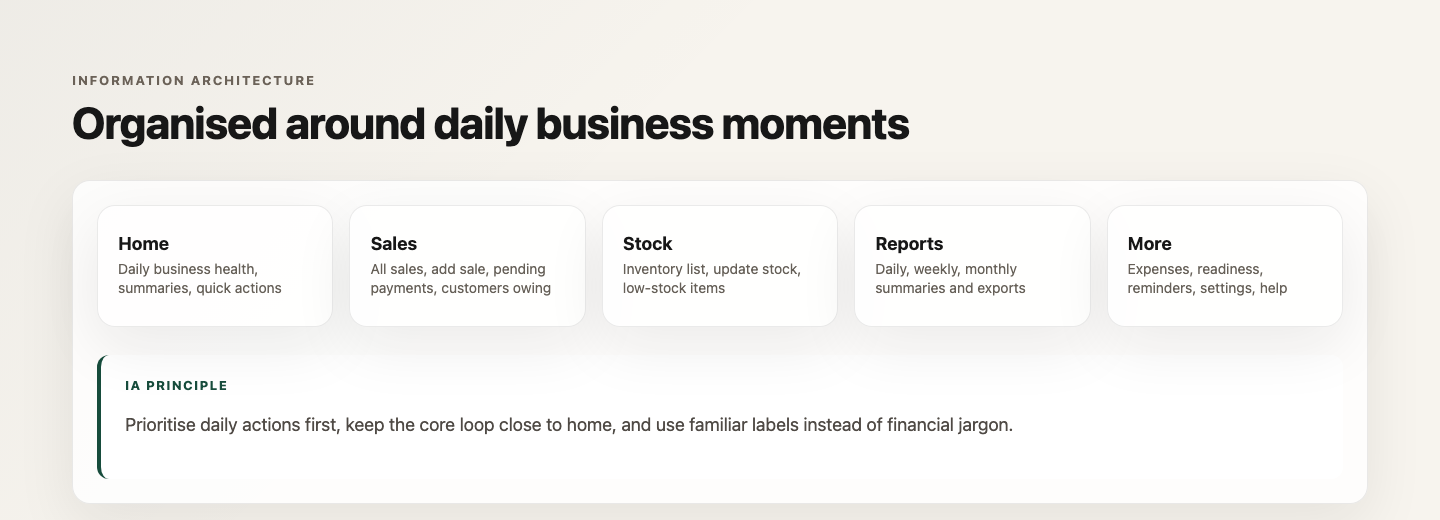
The information architecture follows everyday business moments instead of accounting categories. I organised the main product around Home, Sales, Stock, Reports, and More, with onboarding and setup as a separate first-time layer.
Portfolio summary based on documented project evidence.
Home gives a quick view of business health. Sales keeps money-in activity and customer owing flows close. Stock stays focused on simple inventory visibility. Reports support review without heavy accounting language. More holds secondary actions such as readiness, reminders, settings, help, and legal/disclaimer information.
This structure reduced translation work. A micro-business owner should not need to understand terms like receivables, reconciliation, or fiscal compliance before they can record a sale or check who owes money. The product language stays closer to familiar business questions: money received, money spent, estimated profit, customers owing, and stock running low.
That choice also made the product easier to test. Participants could react to everyday tasks instead of first learning an accounting model.
Designing the core workflow
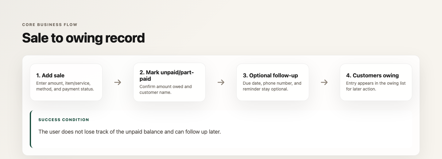
The most important workflow decision in BizPilot is the sale-to-owing loop. In many small business contexts, receiving money is not always a clean binary event. A customer may pay later, pay part of the amount, promise a transfer, or need a follow-up. If the product only records completed sales, unpaid value can disappear into memory.
Portfolio summary based on documented project evidence.
I separated payment method from payment status. Payment method answers how the customer paid: cash, transfer, PoS, or another method. Payment status answers whether the business has actually received the full amount. That distinction allowed unpaid and part-paid sales to become first-class records rather than notes hidden inside a transaction.
The unpaid sale flow asks for the amount owed and customer name, while due date, phone number, and reminder remain optional. That was a deliberate trust and scope choice. BizPilot can support follow-up, but it should not imply automated debt collection or require unnecessary customer data.
05
From v1 → v2 → v2.1
Iteration made the product more trustworthy and more specific
The wireframe progression is one of the clearest parts of the evidence chain. The first design was not treated as final. The structure moved through v1, v2, and v2.1 before the high-fidelity direction was locked.
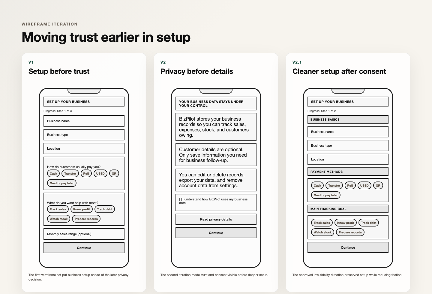
Privacy moved earlier in the setup flow so sensitive business information was contextualised before deeper requests.
In v1, setup came before explicit trust and privacy framing. That made the product faster on paper, but it asked for business information before the product had explained how that information would be treated. In v2, privacy moved earlier. In v2.1, setup was simplified after consent so the user still reached the product without unnecessary friction.
That change mattered because business records are sensitive. A product that asks about money, customers, sales, and readiness needs to establish trust before requesting deeper information.
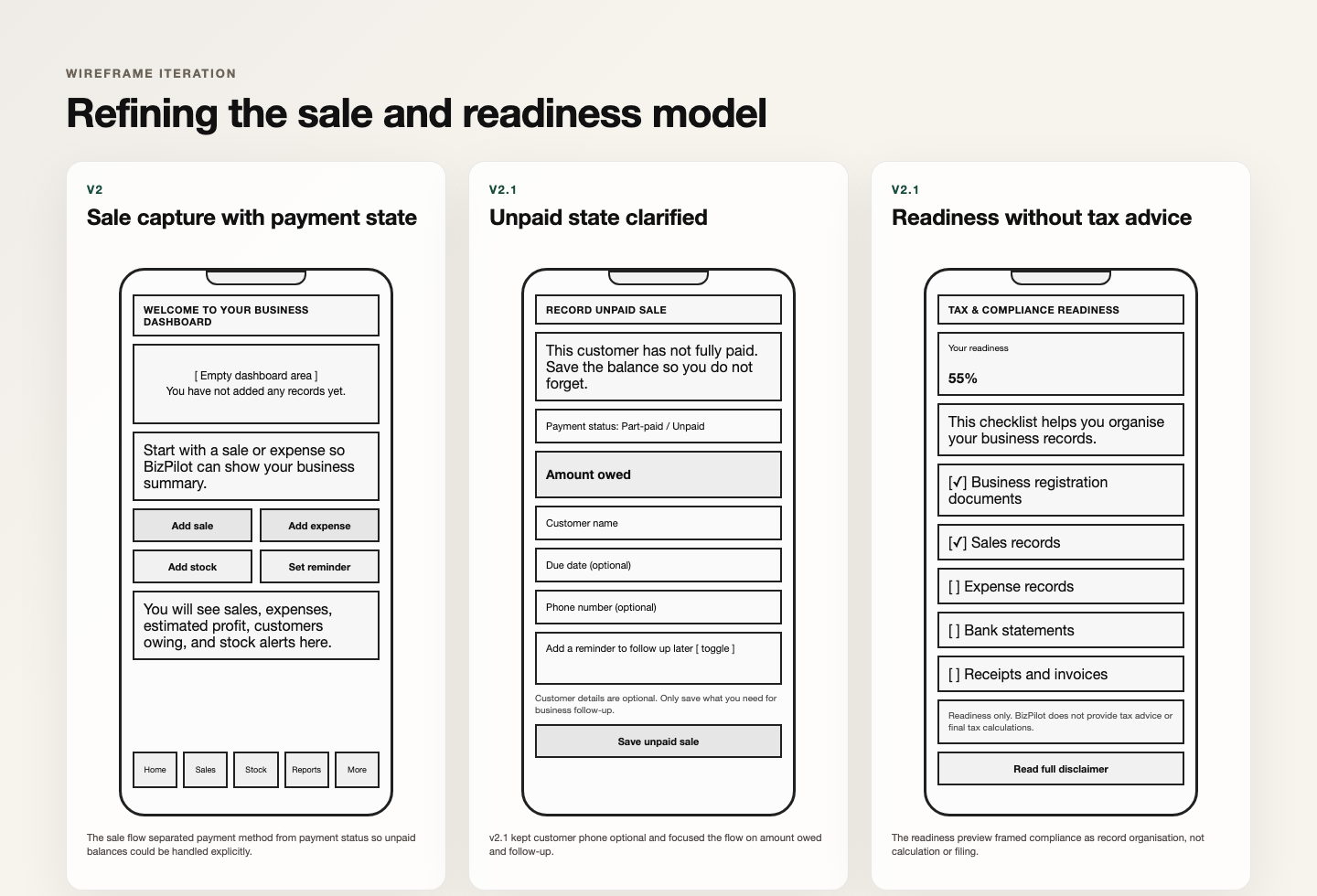
The second iteration thread clarified amount entry, payment uncertainty, and the boundary between readiness and tax filing.
The second iteration thread focused on payment uncertainty and readiness. The sale flow made amount entry prominent and treated payment status as a specific product decision. The unpaid/part-paid state made amount owed explicit. The readiness preview moved toward record organisation and away from anything that could feel like tax calculation or tax filing.
06
Building the visual system
Calm enough for money, clear enough for daily use
The visual system had to make business information feel understandable rather than intimidating. I used warm off-white surfaces, deep green and navy trust cues, white cards, restrained shadows, plain-language badges, large financial numbers, and amount-first forms.
Warm canvas
Low-pressure background
#F6F0E5
Trust green
Primary product cue
#174C3C
Deep navy
Supporting emphasis
#1D3557
Ink
Readable numbers and text
#152532
The coded mobile system specifies a platform sans-serif scale from 11 to 28 pixels. Large financial amounts lead each view; short, plain-language labels explain what each number means.
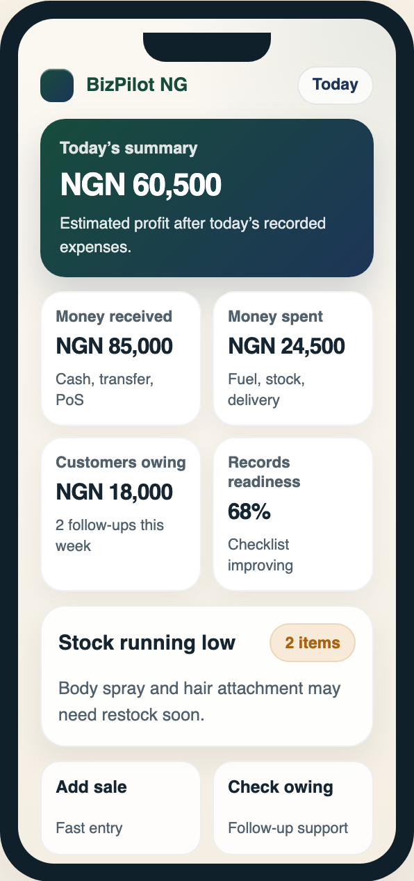
Open the existing screen at full size.
Summary cards
Separate received, spent, owing, stock, and readiness signals.
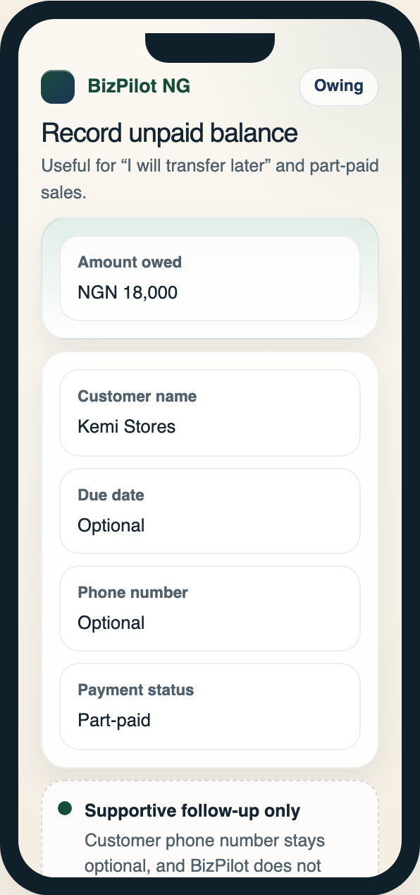
Amount-first forms
Put the amount before optional customer and follow-up details.
Semantic badges
Distinguish warning, confirmation, and incomplete states with words as well as colour.
Daily scan
Amount owed first
Records readiness
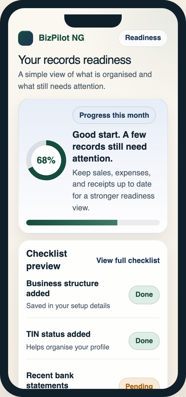
The visual system shown across three complete, consistently scaled mobile screens.
The dashboard became the main value screen. It separates money received, money spent, estimated profit, customers owing, stock running low, and records readiness into scannable cards. The point was not to make a dense finance dashboard. The point was to help a business owner understand the state of the business at a glance.
The forms follow the same principle. Amount comes first because it is the core action. Supporting details come after: payment method, payment status, customer name, and notes. The visual hierarchy supports speed, but the copy still reminds the user that payment tracking is manual and confirmed by the business owner.
Readiness screens use clear progress language and disclaimer patterns. The design needed to make readiness feel useful without giving the impression that BizPilot calculates final tax or files anything on the user's behalf.
07
The final product experience
One connected operating picture
By the final design stage, the individual workflows worked as one connected operating picture: record activity, see what changed, identify what needs attention, and keep better records over time.
Business health
Track owing
Follow up
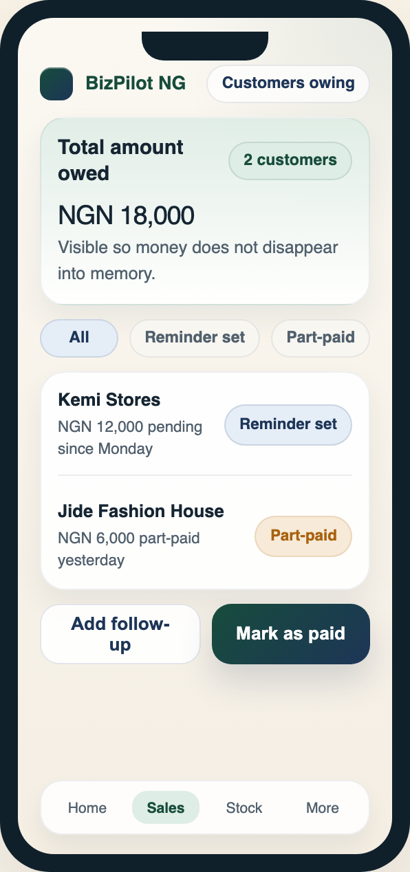
Dashboard → unpaid balance → customers owing. The complete screens retain their original device proportion and consistent scale.
The dashboard gives a daily business-health view. The unpaid balance flow records money that has not fully arrived. Customers owing turns informal follow-up into a visible part of the product. Readiness shows how organised records can support future compliance or planning needs without making legal promises.
The important part is how those pieces relate to each other. A sale is not just a saved entry; it can affect the dashboard, create an unpaid balance, and give the owner something clear to follow up on later. Stock is not a full inventory system; it is a lightweight signal for items that may need attention. Reports are not positioned as accounting output; they help the owner review what has been recorded and spot gaps.
That connected view kept the product grounded in daily behaviour. BizPilot asks for small record-keeping actions, then turns those actions into a clearer picture of money, customers, stock, and readiness.
The payoff is the reframed proposition: BizPilot is not only about tax readiness. It is about giving a phone-first business owner a clearer operating picture before problems build up.
08
Testing the experience
Small, directional usability checks
I tested BizPilot in two documented stages. The first was a 2-participant low-fidelity pilot. The second was a 3-participant coded-frontend pilot. Across both rounds, participants had practical business experience and included supermarket owners, cooks, and a hairstylist.
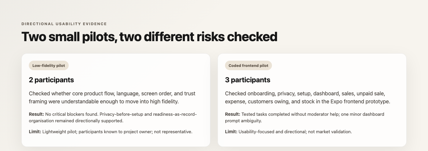
Two small usability pilots supported design and usability decisions at the prototype stage.
The low-fidelity pilot checked whether the v2.1 wireframes were understandable enough to move into high fidelity. It focused on product flow, language, screen order, and trust framing. No critical blockers were identified. Participants understood the privacy notice, the main sales and expense flows, customers owing, stock warnings, and readiness as record organisation rather than tax filing.
The coded-frontend pilot checked whether the Expo / React Native prototype was understandable across onboarding, privacy, setup, dashboard, sale capture, unpaid sale capture, expense capture, customers owing, and stock visibility. All three participants completed the tested tasks without moderator help. One participant hesitated when asked what the business "made," which pointed to a minor prompt ambiguity rather than a strong interface failure.
09
From design to coded prototype
Implementation awareness without losing the product point
After the design direction was established, I translated the product into an Expo / React Native coded frontend prototype. The implementation covered the major product areas: onboarding, privacy, business setup, readiness setup, dashboard, sale capture, unpaid sales, expenses, customers owing, stock, reports, reminders, settings, and data controls.
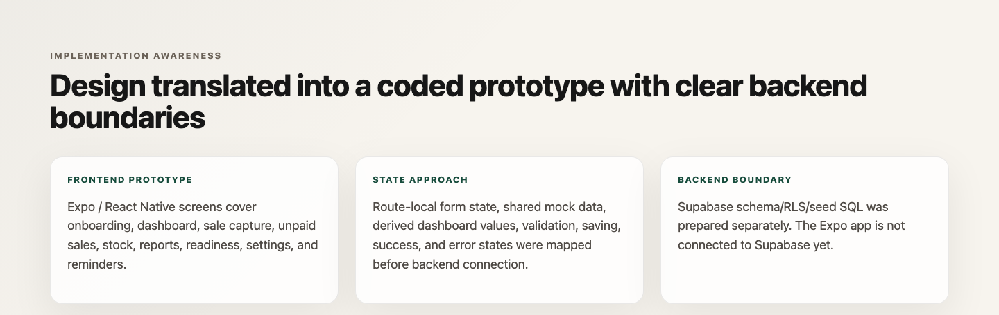
Implementation status: major flows are represented in the coded frontend, while persistent backend connection remains separate.
The design-to-code work made product-state decisions more concrete. Forms needed validation, saving states, success feedback, and error handling. The dashboard needed derived values from mock records. Customer owing, stock, reports, readiness, reminders, and settings needed enough structure to be reviewed as a working mobile experience, not only as static screens.
The prototype currently uses mock/local state. Supabase database infrastructure was prepared separately, including documented schema, RLS policy, and seed SQL execution. The Expo app is not connected to Supabase yet, and the product has not been launched.
The point of this work is not code volume. It shows design-to-build continuity: the UX structure, content decisions, component patterns, and state behaviours were specific enough to survive translation into a working frontend.
10
Reflection & what I'd test next
A stronger product question, with clear next steps
What I learned
BizPilot reinforced that the first visible problem is not always the product problem. The origin was compliance-adjacent, but the stronger design opportunity was everyday operating clarity. A business owner who cannot reliably see sales, expenses, unpaid balances, stock risk, and records readiness is not only facing a tax problem. They are making daily decisions with weak visibility.
I also learned that trust has to appear before sensitive data requests. Moving privacy before detailed setup was a small structural change, but it made the product feel more responsible. In a product that touches business records and possible customer information, trust is part of the flow, not a settings-page afterthought.
The work also made clear that "simple" financial products still require careful language. Money received is not the same as estimated profit. Payment method is not the same as payment status. Readiness is not the same as tax filing. Those distinctions affected IA, form design, dashboard labels, testing prompts, and implementation state.
Limitations
My early understanding of the problem relied primarily on contextual and secondary research rather than a deep primary-discovery study. Later, I ran two small usability pilots to evaluate the evolving experience. That evidence supports design and usability decisions at the prototype stage, but it does not support broad market claims about Nigerian MSMEs.
The prototype has not been used by real businesses in production. There is no revenue, adoption, retention, conversion, customer-growth, or business-impact data. The Expo frontend uses mock/local state, and the Supabase database work is not connected to the app yet.
What I'd test next
The next research step would be broader testing with actual micro-retailers and service sellers, followed by longitudinal use over several weeks. I would focus on whether people build a habit of entering records, whether they understand estimated profit and readiness, whether unpaid-customer follow-up feels useful without feeling invasive, and whether inventory-lite is enough for early operational value.
I would also test trust around business and customer data before connecting the app to persistent storage. Once Supabase integration is complete, the next validation would need to check data persistence, account boundaries, recovery states, and whether the prototype still feels simple when it behaves like a real product.