01
Designing from operational context
A simple request can create a complex fulfilment workflow
This project did not begin with a formal discovery study. I did not conduct interviews, surveys, personas, or usability testing before the design work. Instead, the starting point was my direct exposure to transport operations while working at Logic Gates and the practical steps involved in moving a request from customer enquiry to fulfilment.
A customer may only need to choose a service, describe the trip, add security support, understand the price, and track what happens next. Behind that apparently simple journey, the company still needs to review the request, confirm payment, adjust pricing when necessary, assign a driver and vehicle, record security requirements, and keep the booking status current.
That difference between what the customer should see and what the operations team must manage became the central design problem.
Logic Gates is one service ecosystem expressed through two product formats: the mobile app I designed in Figma and the responsive web platform developed later. Within the web platform, the customer-facing experience and the internal operations portal work with the same booking journey from different sides.
02
The mobile app came first
Exploring the service before translating it to web
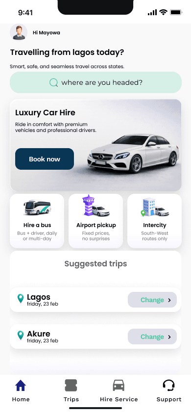
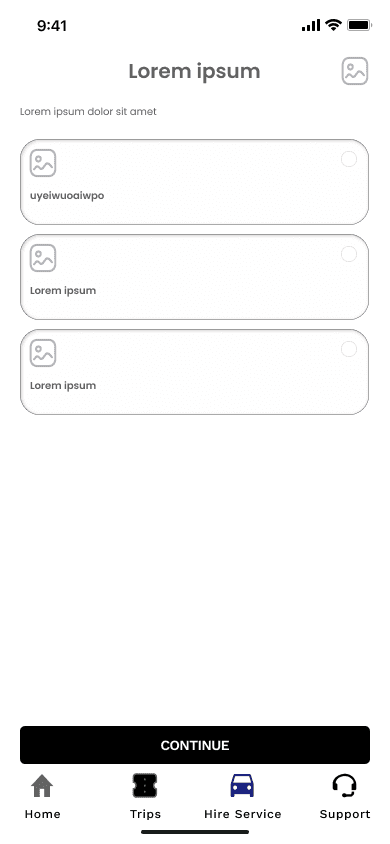
I independently designed the mobile application in Figma before the current web product. I created low-fidelity and high-fidelity screens covering service discovery, quick-trip entry, booking details, payment, and confirmation. The work represents a complete product-design exploration, but a developed native application has not been verified.
Exploring how customers browse the service offer.
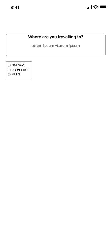
Capturing the minimum trip context needed to continue.
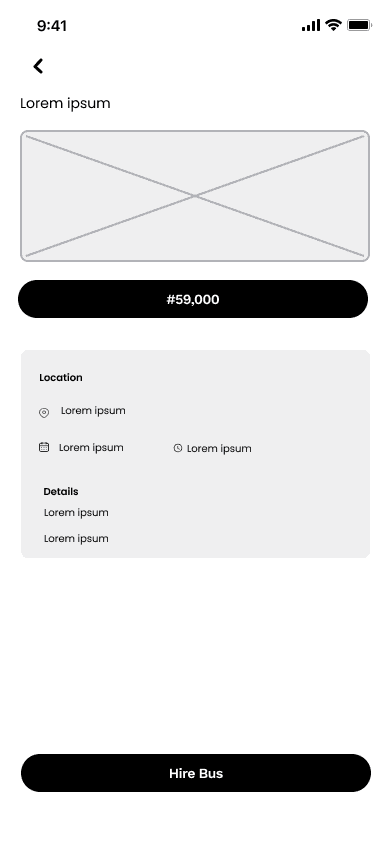
Closing the flow with a clear request summary.
The low-fidelity work helped establish the service hierarchy and the sequence of a booking. The customer first understands what can be booked, then enters the trip information needed to price and organise it, and finally reviews the request before confirmation.
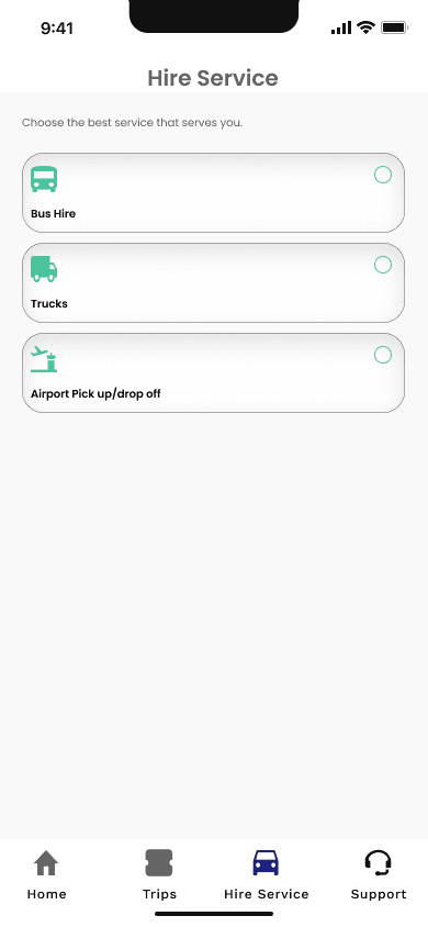
The service hierarchy in the refined visual system.
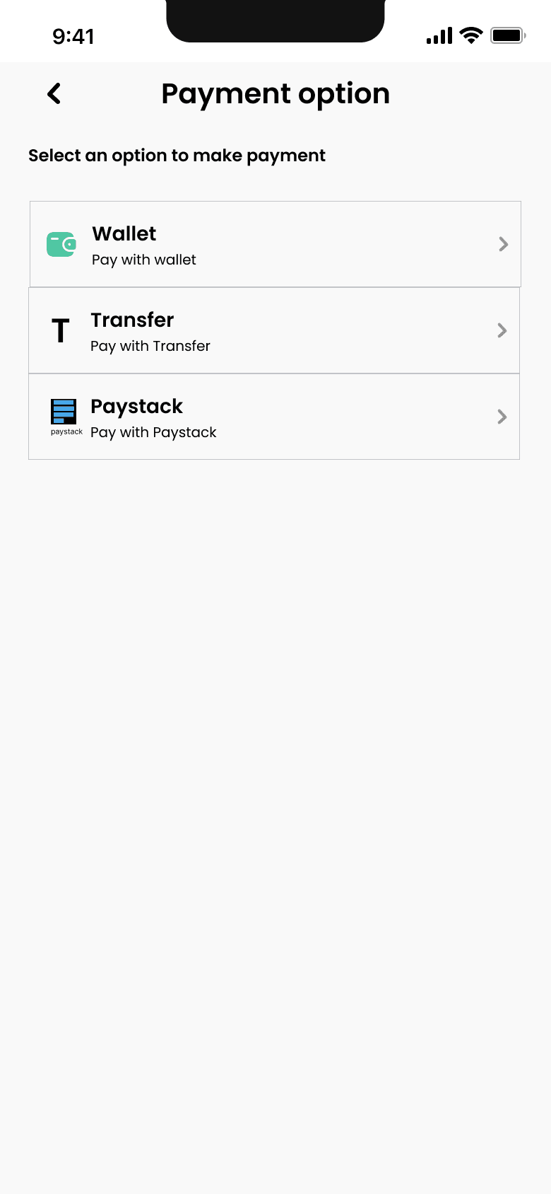
A structured review of price and payment.
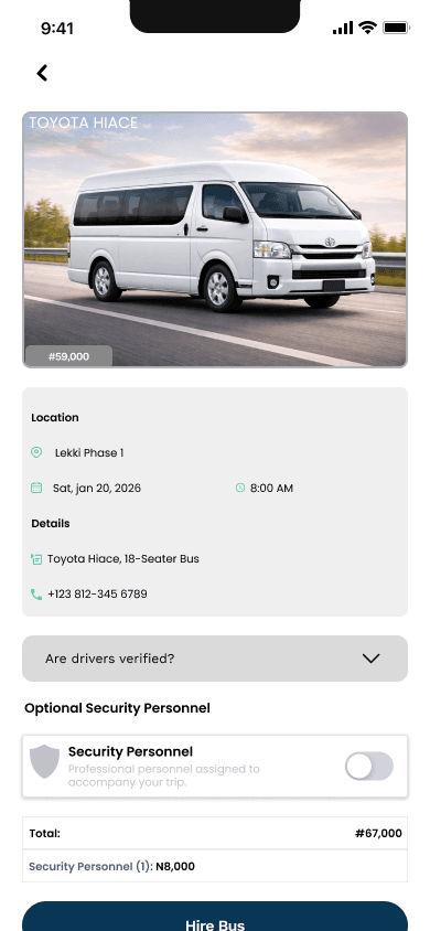
Confirmation as the handoff into fulfilment.
The high-fidelity exploration gave the product a clearer visual language and made the transitions between browsing, booking, payment, and confirmation more concrete. When I later moved the product to the web, I kept the same underlying journey but adapted the screens for responsive layouts, customer accounts, price review, checkout, and operational administration.
03
One service, two interfaces
Separating customer simplicity from operational complexity
The experience is organised around one booking journey. Customers create and review a request through the public and account-facing screens. Operations staff use the internal portal to add the details needed to coordinate fulfilment and move the same request forward.
On the customer side, I designed service discovery, registration and sign-in, a four-step booking flow, price review, payment options, booking history, and status visibility. On the operations side, I designed booking and customer records, payment visibility, price adjustments, driver and vehicle assignment, security coordination, and status progression.
Keeping the interfaces distinct allowed each side of the service to stay focused. Customers do not need to see internal coordination fields, while operations staff need more context and control than the customer interface should expose.
04
Guiding the customer
A staged booking journey instead of one dense form
Transport bookings combine several kinds of information: the service, vehicle type, pickup and destination, date and time, trip type, passenger or job details, and optional security support. Putting all of this into one page would make the booking feel heavier than necessary.
I organised the experience into four stages:
- Choose the service and vehicle.
- Enter the trip details.
- Select add-ons such as security personnel.
- Review the full request and price before submission.
The sequence gives each decision a clear context. Vehicle choices depend on the selected service. Security requirements affect the quote. The review stage brings the information together before the booking is created.
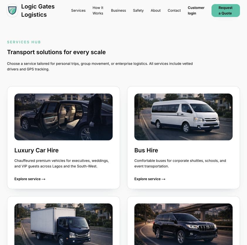
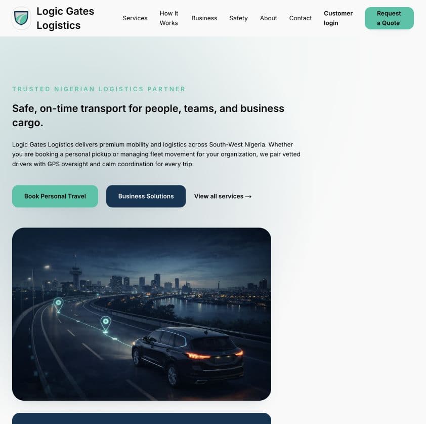
The public website explains the service offer before asking the customer to configure a booking.
The public website supports this journey by explaining the service offer before asking the customer to create a booking. The current marketing experience includes airport pickup, bus hire, luxury car hire, truck hire, safety, business transport, and process guidance.
The designed booking journey currently covers bus hire, airport pickup, luxury transport, and intercity travel. This reveals an important product gap: truck hire is marketed but is not available as a booking category, while intercity travel is bookable but does not have its own dedicated service page.
05
Connecting booking to fulfilment
The operations portal absorbs the complexity
Submitting a booking is only the midpoint of the service. The request still needs operational attention before it can become a completed trip.
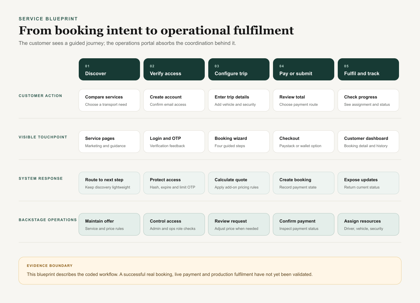
The blueprint makes the frontstage-to-backstage handoff explicit while preserving the current evidence boundary.
The service blueprint connects five stages: discovery, access verification, trip configuration, payment or submission, and fulfilment tracking. For each stage, it separates what the customer does, what the interface shows, what the system records, and what operations needs to handle.
This distinction was important because a customer-facing confirmation screen cannot prove that resources have been assigned. The operations portal needs its own explicit controls for reviewing the request, checking payment, adjusting the commercial details, assigning a driver and vehicle, recording security support, and moving the booking through paid, assigned, completed, or cancelled states.
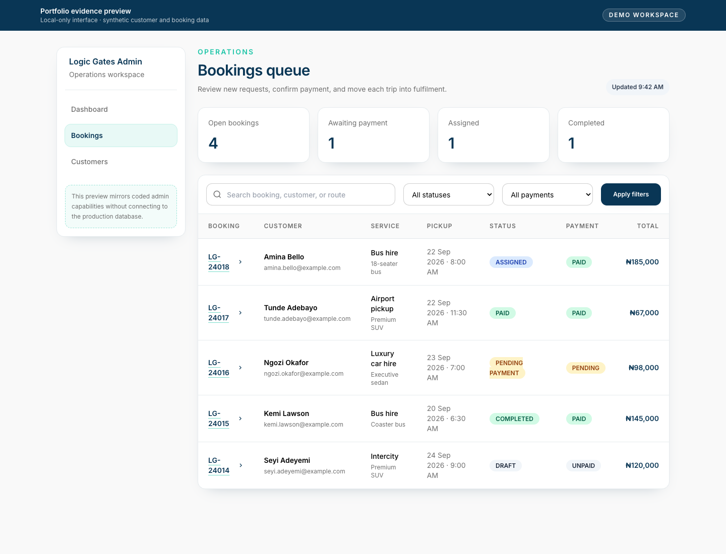
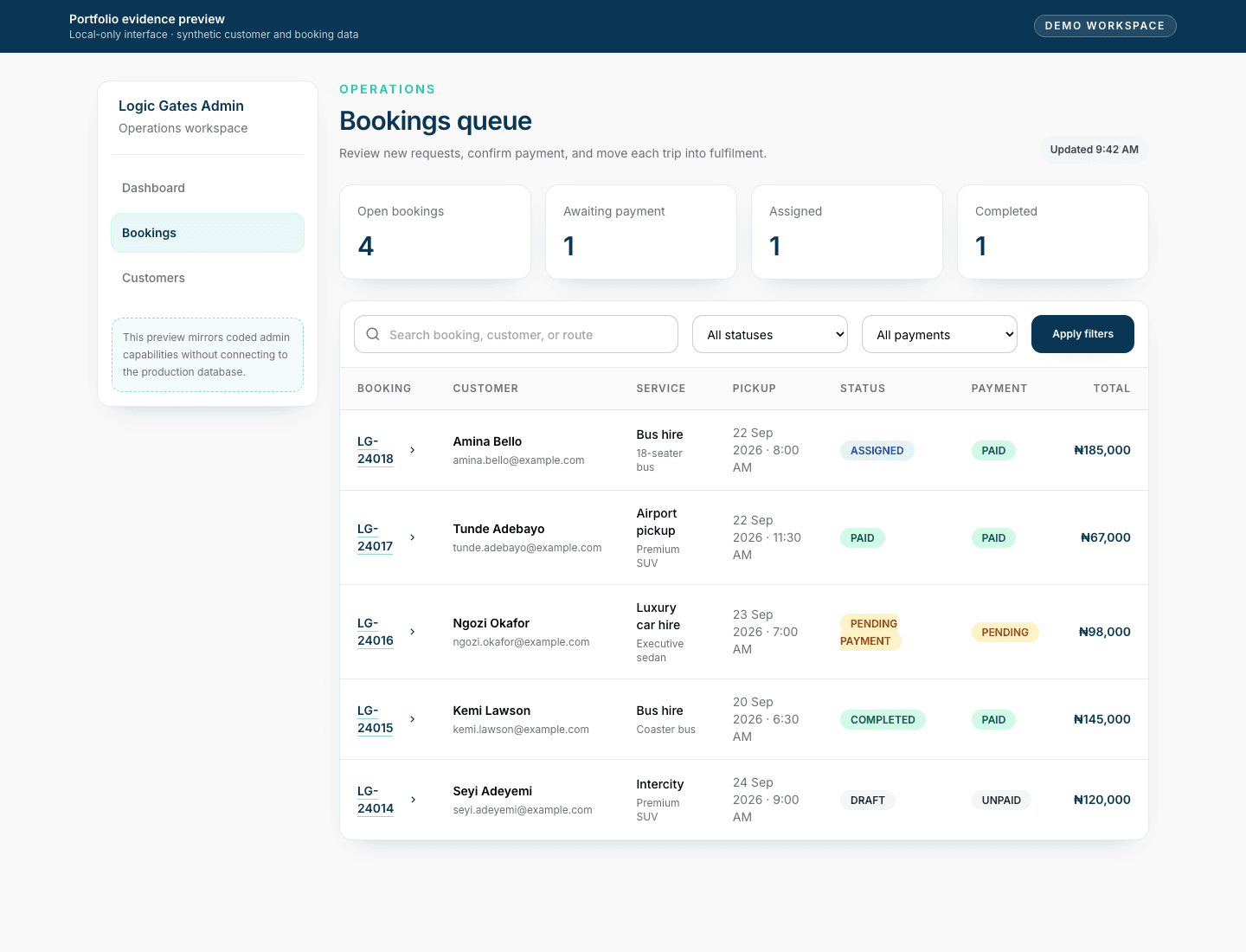
The bookings list supports scanning across service, date, price, payment, and fulfilment status. Synthetic records are used throughout.
The bookings list supports scanning across multiple requests. Staff can see customer details, service type, date, price, payment state, and booking status before opening the full record.
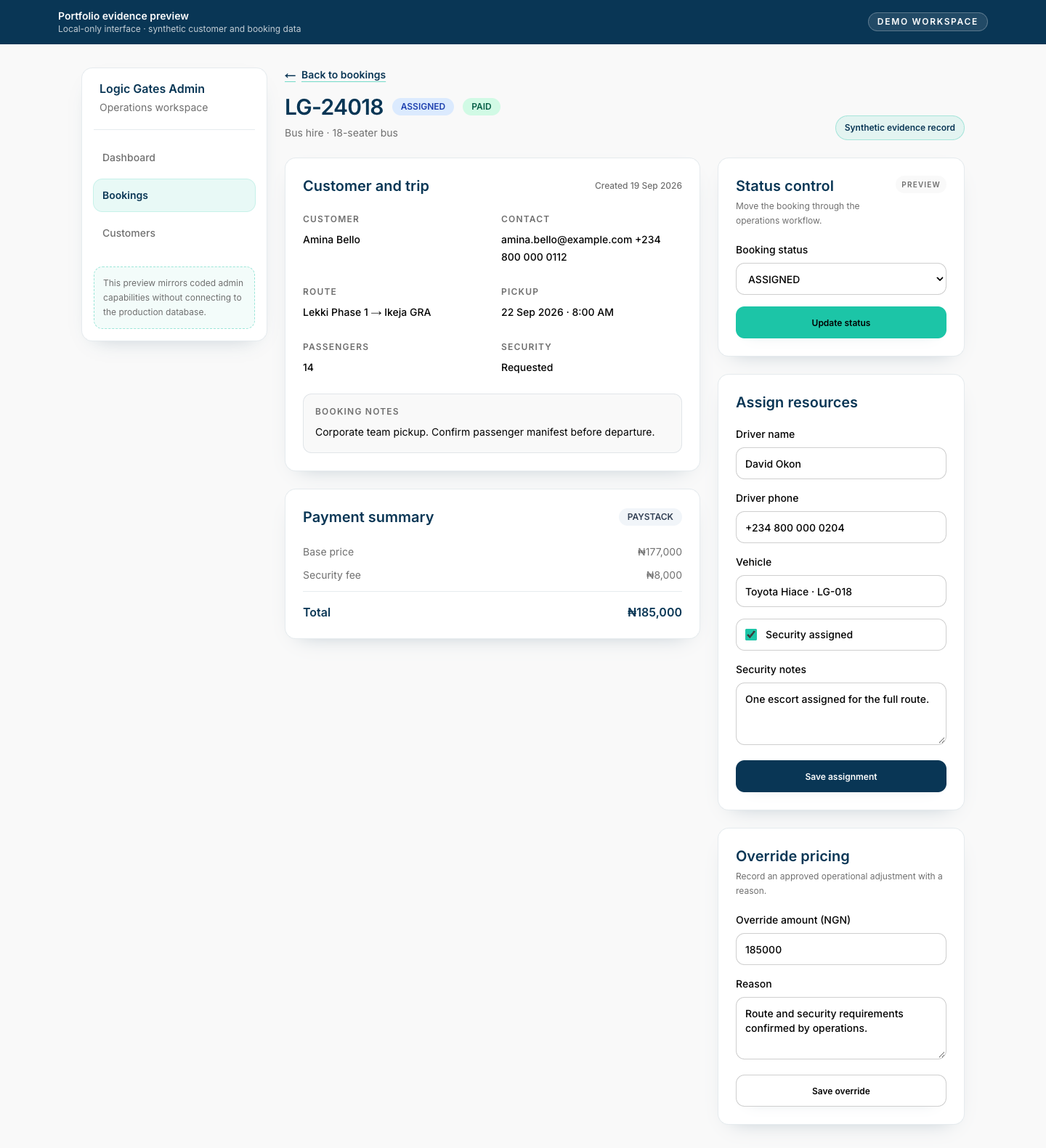
The detail view turns a customer request into a working fulfilment record.
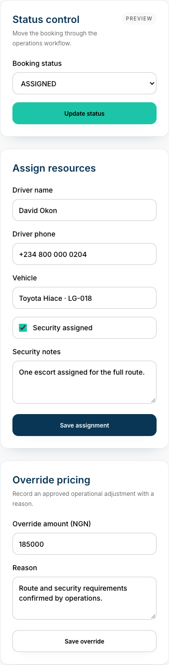
Assignment and commercial controls remain close to the booking context.
Assignment and commercial controls sit beside the booking details so operations can act without switching between disconnected tools. The workflow brings driver and vehicle details, security assignment, price adjustment, payment state, and booking progression into the same context.
06
Designing for trust and control
Making uncertainty visible
Logistics bookings contain uncertainty that should not be hidden. A quoted amount can change after operational review. Payment may be pending or fail. A driver may not yet be assigned. Security may be requested but still need confirmation.
Rather than treating all bookings as complete immediately after submission, the product uses explicit booking and payment states. Customers can see the current position of a request, and operations can update the record as fulfilment progresses.
I used the same principle across account and operations screens: make identity, payment, assignment, and booking status visible at the moment each decision is made. Confirmation messages explain what has happened, while pending states show what still needs attention.
07
Design principles
A consistent system across customer and operations experiences
Three principles kept the mobile and web work aligned as the service expanded: progressive disclosure for customers, explicit status language for uncertain moments, and contextual controls for operations staff.
- Reveal booking questions in a clear sequence instead of presenting one dense form.
- Keep payment, assignment, and trip progress as separate states so the interface does not imply more certainty than exists.
- Place operational actions beside the booking context needed to make each decision.
These principles allowed the customer screens to remain calm and guided while the operations portal could support denser information and more frequent decision-making without feeling like a different product.
08
Visual system
A clear web language for booking and operational status
The mobile app exploration came first and uses light surfaces, mint service cues, and compact selection cards. The later responsive web product established its own navy and teal interface rules for public booking, customer accounts, and operations. The two formats belong to the same service journey, but they are separate visual explorations.
Navy
Headings and key actions
#093655
Teal
Booking and service cue
#1CC5A7
Off-white
Quiet page surface
#F9F9F9
Muted grey
Supporting information
#6F6F6F
The responsive web UI specifies Inter. Strong navy headings and compact supporting copy keep service choices clear while denser operations views use labels and status badges for scanning.
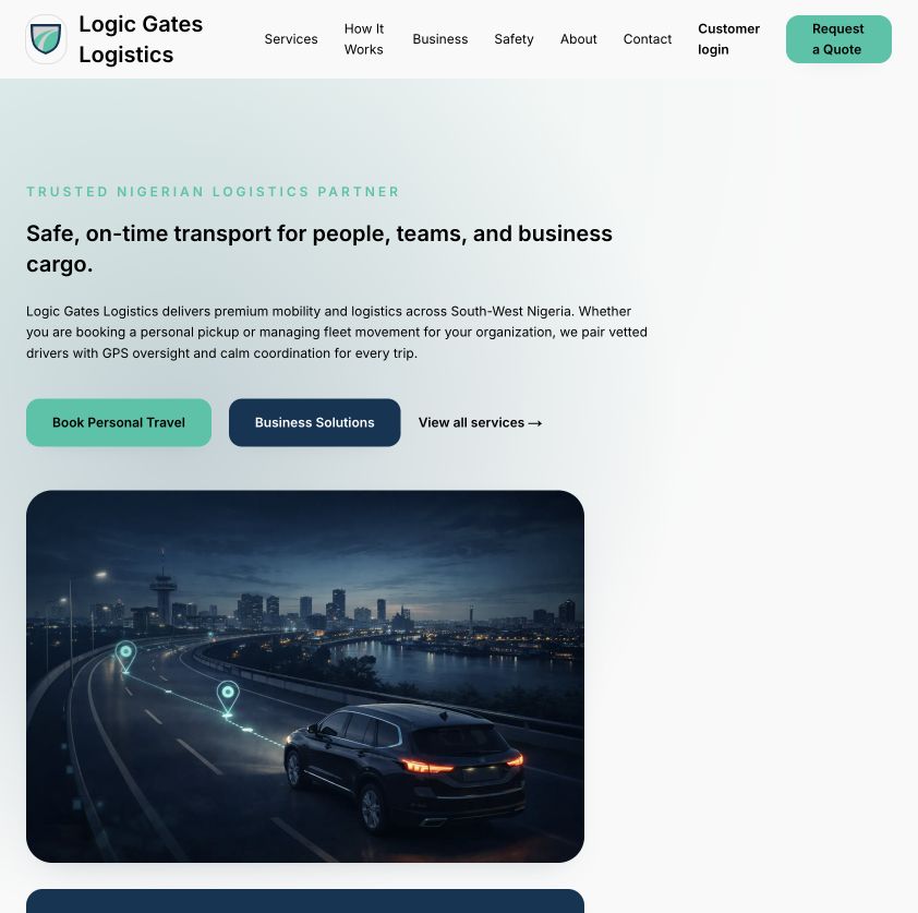
Open the existing screen at full size.
Action hierarchy
Teal and navy actions distinguish primary booking from supporting paths.
Form surfaces
Rounded cards and inputs group each decision in the staged booking flow.
Status badges
Payment and fulfilment use distinct labels and semantic colour treatments.
09
Design evidence and limitations
What is designed and what still needs validation
The case study includes low- and high-fidelity mobile designs, responsive customer screens, the four-step booking journey, account and status views, internal operations screens, and a service blueprint connecting both sides of the experience. The admin captures use synthetic records.
Several product decisions remain unresolved. Truck hire is promoted but is not available in the booking journey, while intercity travel appears in booking without a dedicated service page. Reporting is still lightweight, and the boundary between admin and day-to-day operations roles needs further definition.
Most importantly, I have not successfully completed a real booking or a documented usability study. There is no verified customer adoption, conversion, revenue, or business-impact data. The placeholder testimonials on the public website are not evidence and do not appear in this case study.
10
Reflection and what I'd test next
The value is in connecting both sides of the service
What I learned
Logic Gates taught me that a service product has to be designed across both sides of the experience. A simple booking form is not enough if the organisation cannot review, assign, update, and fulfil the request behind it. The strongest part of this project is not an individual screen; it is the connection between customer intent and operational action.
The project also showed me how designing the full service exposes gaps that individual screens can hide. Service categories have to align across marketing and booking. Payment states need to be distinct from trip states. Price changes need a reason and visible source. An assignment is not only a checkbox; it needs enough context for operations to understand what has been confirmed.
Limitations
The project did not begin with formal customer research, and I have not completed a documented usability study. My early decisions were informed by direct operational exposure and iterative product review, but they should still be treated as assumptions until tested with customers and operations staff.
The end-to-end service remains unverified in real use. The synthetic operations captures demonstrate the intended workflow, but they do not prove that customers and staff can complete every handoff clearly and reliably.
What I'd test next
I would begin with a controlled end-to-end booking walkthrough: discovering a service, entering trip details, choosing security support, reviewing the price, submitting the request, completing operations review and assignment, and checking the customer-facing status update.
I would then run task-based usability sessions with prospective customers and operations staff. The customer study would focus on service selection, pricing, security options, and status clarity. The operations study would focus on scanning bookings, reviewing detail, assigning resources, recording adjustments, and progressing fulfilment without hidden spreadsheets or side conversations.